Welcome to
Home Made

Problem Space
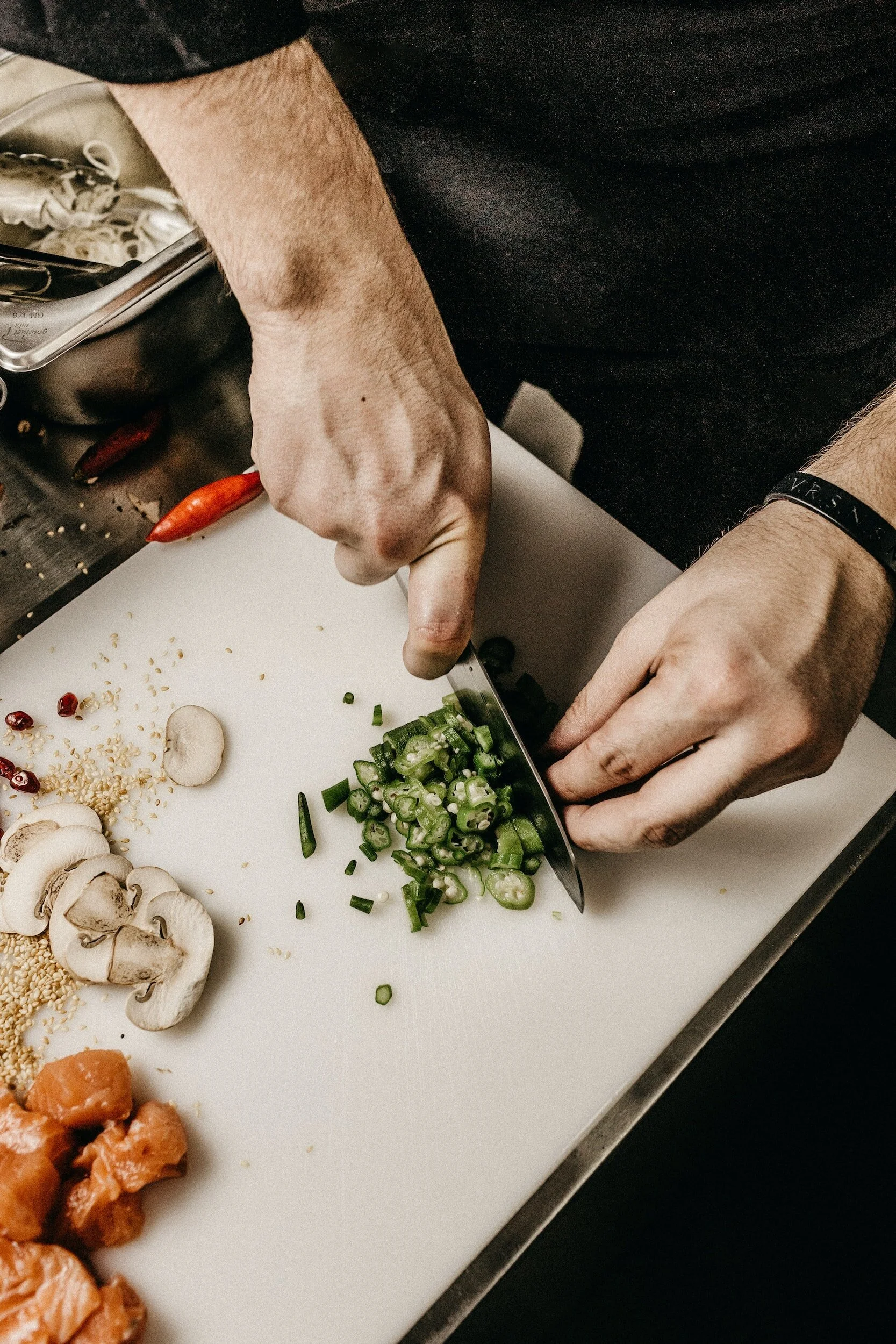
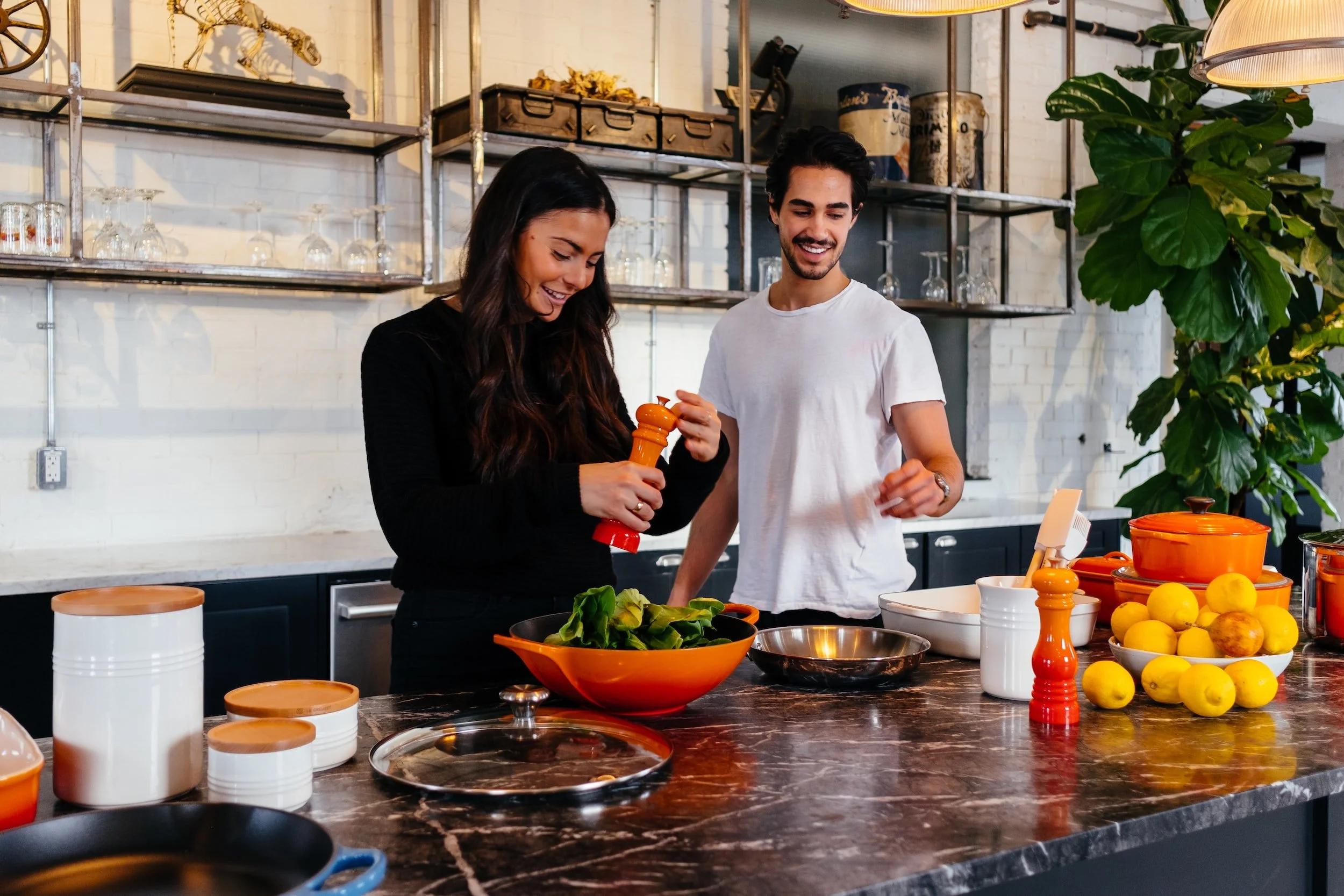
Despite the abundance of food delivery apps available today, there is still a lack of options for those who crave homemade food that is not only delicious but also healthier and more affordable than restaurant meals. Many home cooks struggle to find a way to share their culinary skills with others and make a living from it. This app, Home made, was created to address these problems by providing a platform for home cooks to showcase their cooking skills and offer their delicious and healthy homemade meals to customers who want an alternative to unhealthy & expensive restaurant food.
Project Overview
TOOLS:
Figma
Zoom
Slack
InVision
Pen + Paper
ROLE:
UX Researcher
UX Designer
CONSTRAINTS:
Native app of choice: Android
Time frame of 10 weeks from discovery to research to handoff
Fully remote project
TIME:
5 Months
To come up with a user-centric solution, I broke-down the double diamond into a 4 step design thinking process. This design process guides me to organize my thoughts to improve the creative process. Each icon represents a stage of exploring an issue more widely or deeply and then taking a focused action.

Discover + Research

Analyze + Define
Ideate + Prototype

Build + Deploy
Discover + Research
Defining The Problem
1 out 5 Canadians
consume food away from home on a daily basis.
Consuming food prepared away from home, whether while eating out at a restaurant or ordering takeout, is quite commonplace in Canada.The average Canadian household spent over one-quarter (26.9%) of its food budget on meals and snacks purchased from restaurants in 2019.
27.7%
of Canadian males aged 19 to 57 were most likely to consume food away from home.
In the overall population, those who had eaten out had consumed, on average, less whole fruit, dark green and orange vegetables; other vegetables (excluding potatoes); whole grains; legumes, nuts and seeds compared with those who had not eaten out on that day; this difference was highest among adolescents.
Research Objectives
We conducted research so as to gain an understanding of how we can increase rates of home cooking, particularly among younger Canadians so that we can design a system that will enable that and in turn lead to better health outcomes.
We hoped to learn how we could incentivize home cooking and what would spur younger Canadians to start cooking at home on a more regular basis. We hoped our research would enable us to design a system that helped them achieve those goals.
Hypothesis
With all the previous research, we found that one of the biggest things stopping people from cooking is the severing of food traditions being passed down from one generation to another, especially the quick-meal hacks that are a staple of home cooking. Hence we hypothesized that if people were reconnected with those food traditions & quick-meal hacks then it would lead to an increase in home cooking.
So I asked…
How might we reconnect people with their food traditions and quick-meal hacks to increase home cooking?
Assumptions
-
![]()
Young Canadians want to learn how to cook more.
-
![]()
Young Canadians want to learn how to cook if they knew how to do it.
-
![]()
Young Canadians want to learn how to cook if they had the time for it.
-
![]()
Young Canadians want to learn how to cook if they knew it would lead to better health outcomes.
-
![]()
Young Canadians want to learn how to cook if they knew it would lead them to saving more money.


Primary Research
Methodology Used: User Interviews
I met 1-on-1 or in person, or virtually with participants to discuss in depth about the participants' thoughts about home cooking. The criteria for participants was ages 18-30 (young Canadians), all socio-economic backgrounds and all kinds of family compositions.
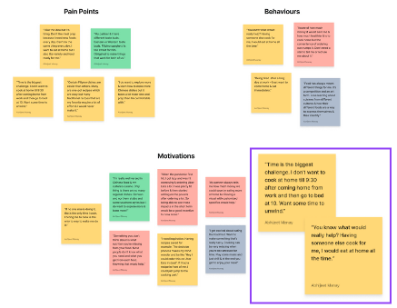
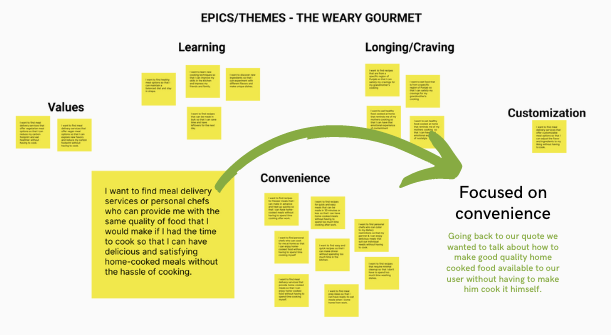
Once all the interviews were conducted, we grouped all the participants observations & insights into four different themes (shown in the graph). The convenience theme was the one mentioned most often compared to what we thought would be more compelling themes as per our hypothesis - i.e cultural connections and health & savings. We pivoted accordingly & regrouped the previous insights and observations into three different categories - pain points, behaviours & motivations to be able to gain a deeper understanding of what dynamics were at play behind each of them. What really stood out were these two quotes (highlighted in the purple box) that made us pivot from our original hypothesis to a solution based more on convenience. We used them when crafting our persona.
Analyze + Define
Interpretation and alignment of findings to project objectives
-
The convenience theme really stood out in terms of it's importance to the participants which is why we had to pivot to making it the focus of our continued process.
-
Namely cultural connections & health & savings while important & note-worthy played a more secondary role when it came to driving the motivations & behaviours & pain points of the participants.
-
So we decided to focus our HMW (How Might We) question on how to make it more convenient for young Canadians to eat more home cooked meals - whether they make it themselves or otherwise because convenience meant ensuring there are options for when they're too tired to cook.
So the new HMW after the pivot was…
How might we make it more convenient for young Canadians to eat more home cooked food so that it leads to better health outcomes?
After this I created a persona + experience map
Experience Mapping
Experience mapping helped me navigate each stage of the user's experience to show the potential routes to reach a particular goal. It also helped me pin point the place where my solution could really help the user on an emotional level and thereby reach them more effectively.
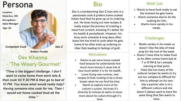
Persona
Personas are a composite form of behaviors, motivations and pain points of the many actual users encountered from the research process. Personas are archetypical users whose goals and characteristics represent the needs of a larger group of users that I came across. By using personas, I can always reference and keep the users in mind. It also helps keep a story line coherent while designing. So I created the persona Dev Khanna - The Weary Gourmet…

Design Intervention
After looking at the experience map I decided that the best opportunity for design intervention here lies in someone already having made the meal for Dev before he arrived home. A service which employed people like UberEats but instead of delivering food, they come to your house & cook food for you in your kitchen, with your ingredients & your spice mixes & your preferences or deliver it to you.
So we created
User Stories
After creating the persona and experience map I realized Dev wanted to focus on:
What was most convenient and cost-effective
Something that helped him learn new things about food and health
Something that was customizable to suit the differing culinary needs of him and his partner
What aligned with his values
What helped satisfying his cravings
These were the topics used to craft the user stories and again after categorizing into 5 different epics, convenience emerged as the important underlying theme once again.
Ideate + Prototype
The creative process of generating, developing, and communicating ideas. Turning them into a product.
Sketching, wireframing, prototyping and testing
It took 2 iterations to design Home Made on a wireframe level. Through iterative user testing I improved my product each time. Since the data showed that users (especially female users) were not comfortable with the idea of a stranger coming home and cooking for you in your kitchen, I decided to ditch that idea and instead modelled the service on food delivery apps to have the user pick up or have the food delivered to them instead.
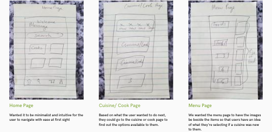
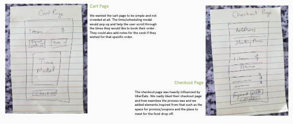
Sketches, wireframes & prototypes were done using pen, paper & Figma
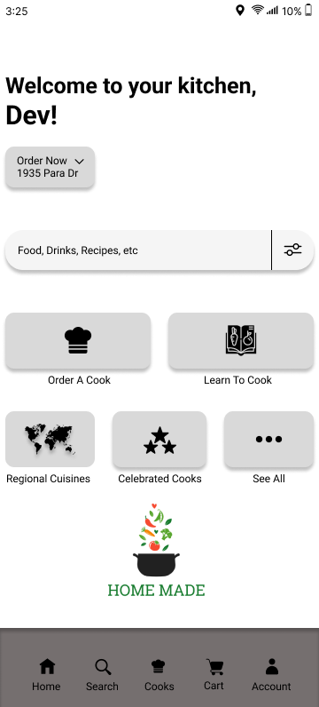
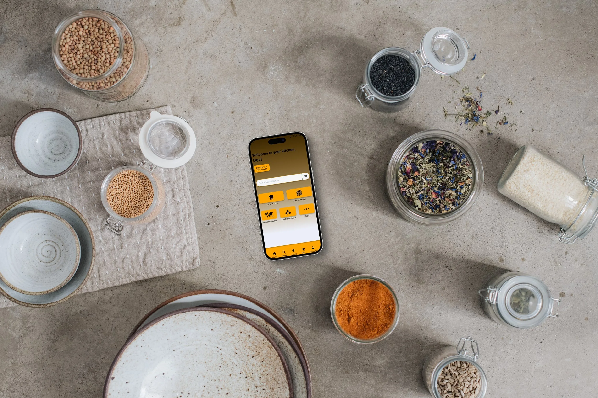
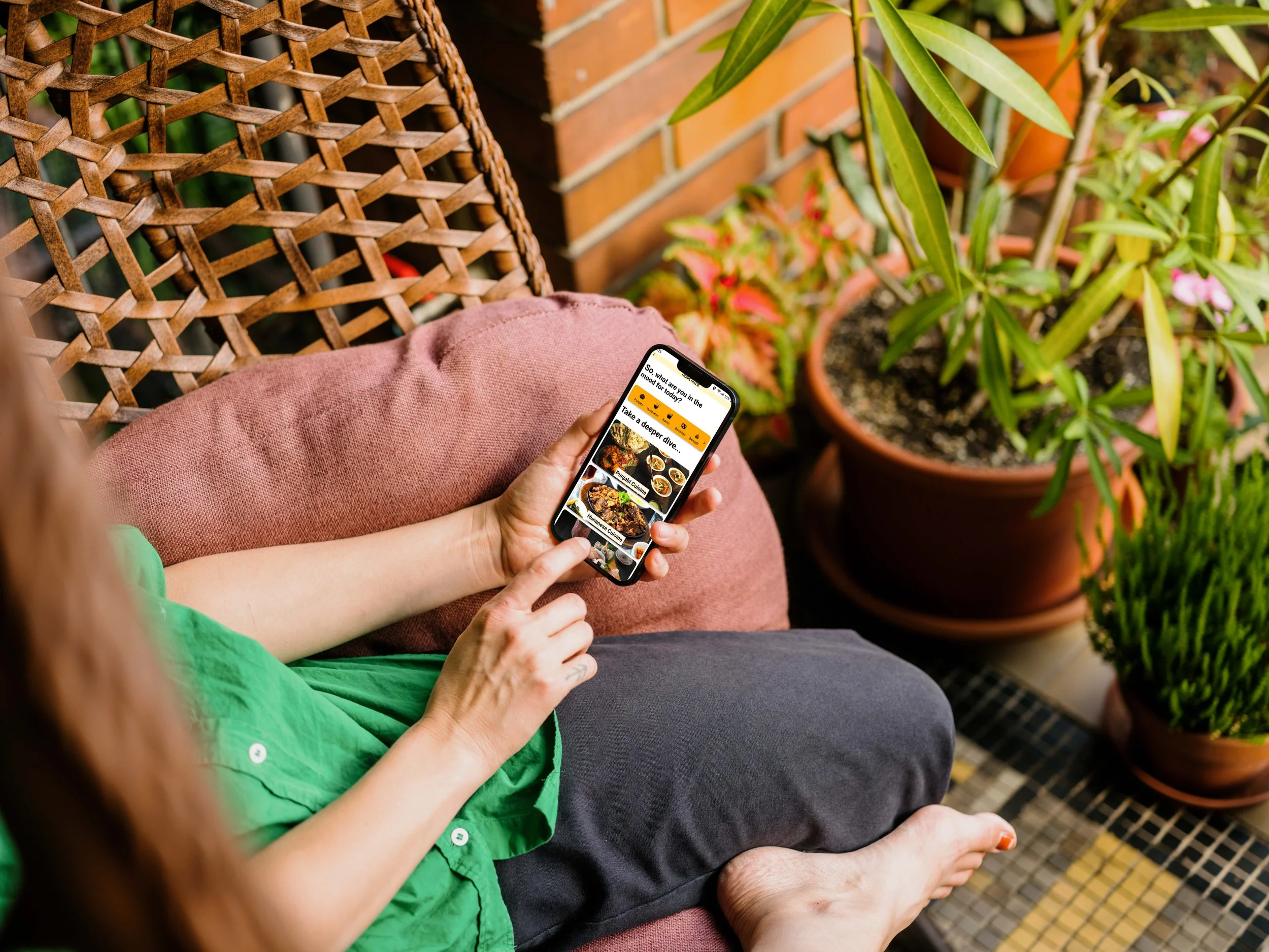
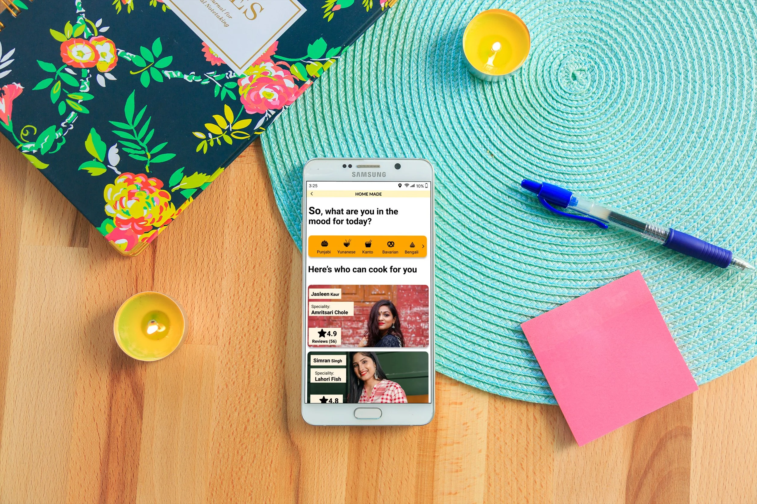
Home Page
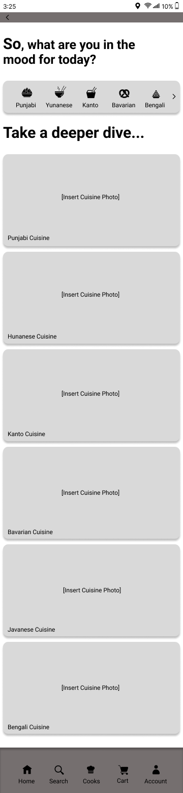
Cuisine Page
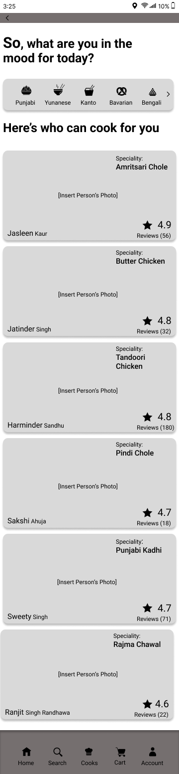
Cooks Page
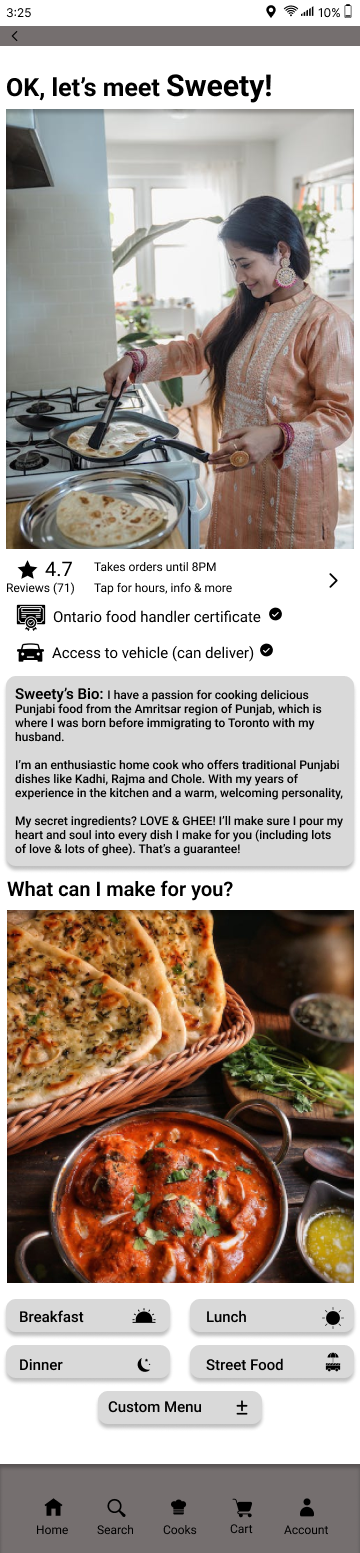
Sweety Page
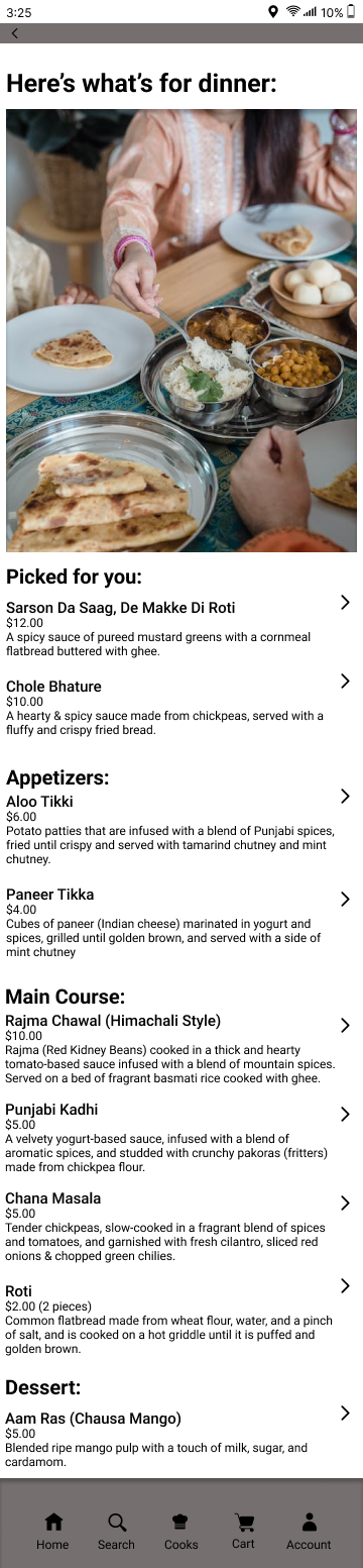
Menu Page
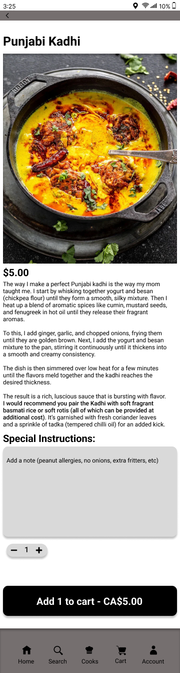
Item Page
Cart Page
(Inactive)

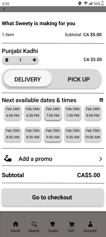
Cart Page
(Active)

Checkout Page
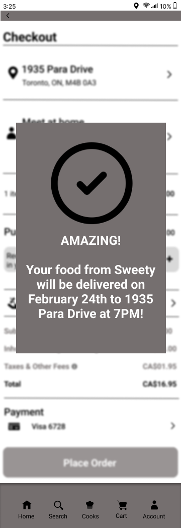
Success Page
Branding Colours
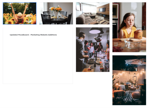
Colours ended up being a bit more complicated than I had predicted. Originally, I chose colours based on (primarily) earth and food themed colours centred around dark & earthy greens. But upon testing them, it wasn’t conveying that inviting feeling coupled with graceful simplicity that I wanted to communicate. So I decided to create a mood board on InVision and a monochromatic palette centred on Web Orange emerged out of it…

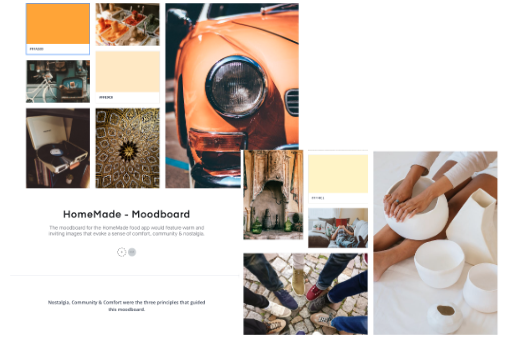
All four colours resided within a monochromatic palette that created a cohesive & harmonious look while also enhancing the focus on the food and the spices and flavours that go with it which is reflected in the names of the colours. It also encapsulated the brand's values of comfort, warmth, community & nostalgia.

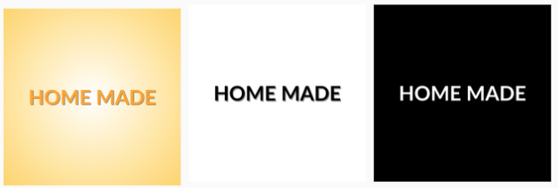
After this I constructed the word mark, with an emphasis on the monochromatic colour palette of web orange inspired by the mood board. I also constructed black on white & white on black versions of it. I added some shadows to the font to help it pop off the screen. I liked the black of white word mark the best because it really evoked that sense of minimalism and simple elegance we were looking for. That is why I used it when constructing the app logo and icon.
Logo/Word Mark
After sketching out the name of the app in a few different weight sizes, I decided that the heavier size felt more comforting and inviting.
Responsive Marketing
I designed a responsive marketing website to excite the users about the product by highlighting the values the product has to offer. The tone of voice was inviting, comforting & simple. The site offers users insights into the product features and allows them to download the app.

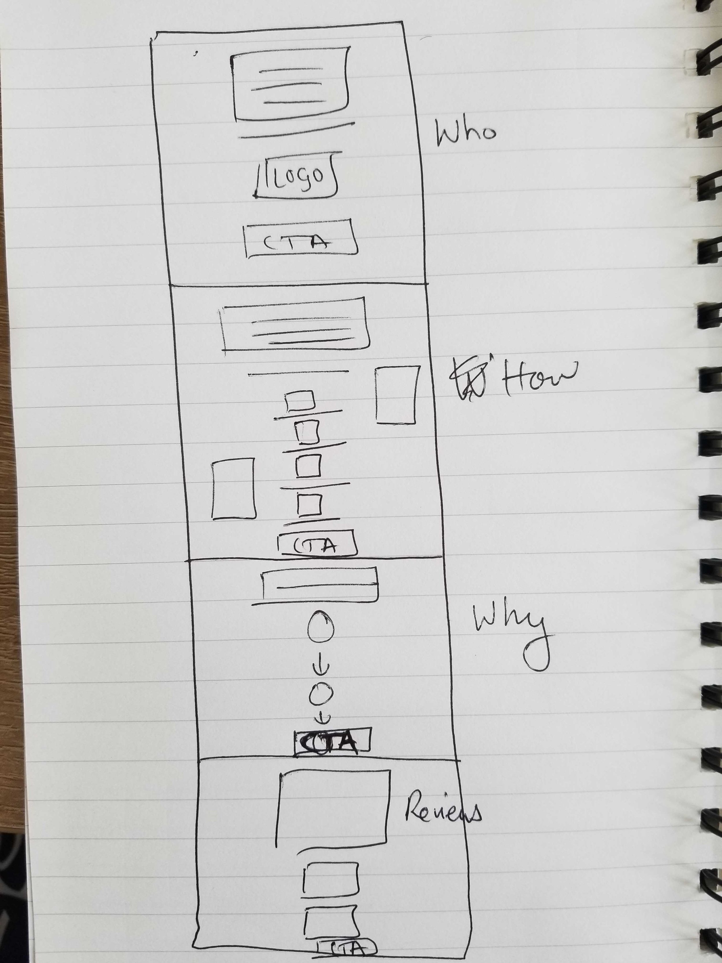
Sketches
We divided the sections into who, how, why & reviews/testimonials as a way of organizing content and this was the final draft of the sketches of the two versions.
Final Responsive Marketing
I wanted this page to have a gradient since the users would arrive here and this aesthetic was visually pleasing and there wasn't too much information. The logo was prominently displayed and an example of what the app would look like on their phone was also immediately visible to give users an idea of what to expect. The tagline and name of the app would also give users an understanding of what to expect. The nav bar at the top was there for the users to navigate to different pages and two CTAs were prominently displayed both in the nav bar and below the phone mockup to direct users to download the app using simple language. All the CTA buttons come directly from the UI Library of the app.


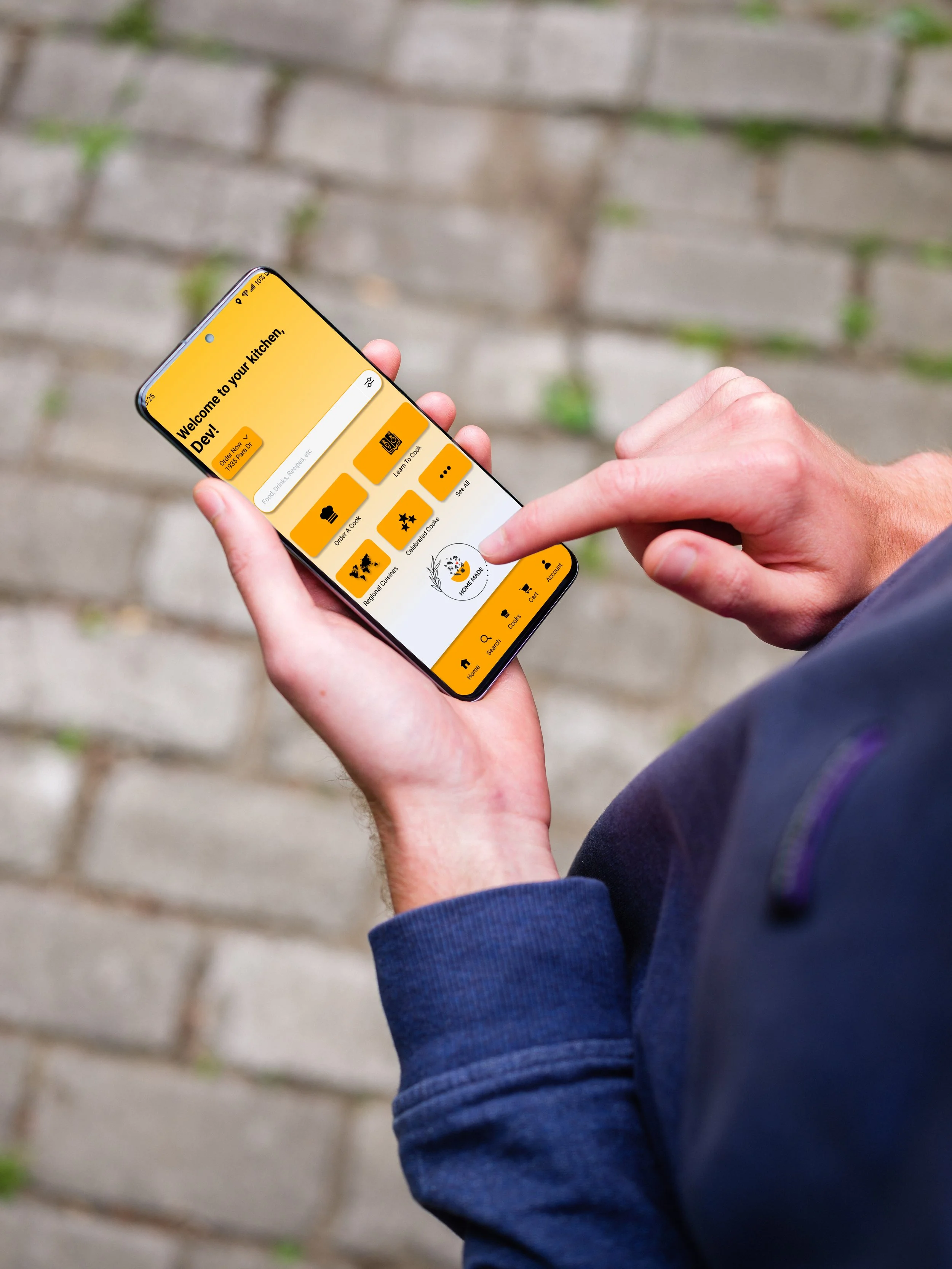
One-Stop Culinary Hub
The option to order home cooked food, learning to cook and finding cooks that are recommended by others are all present on the same page the moment you login.
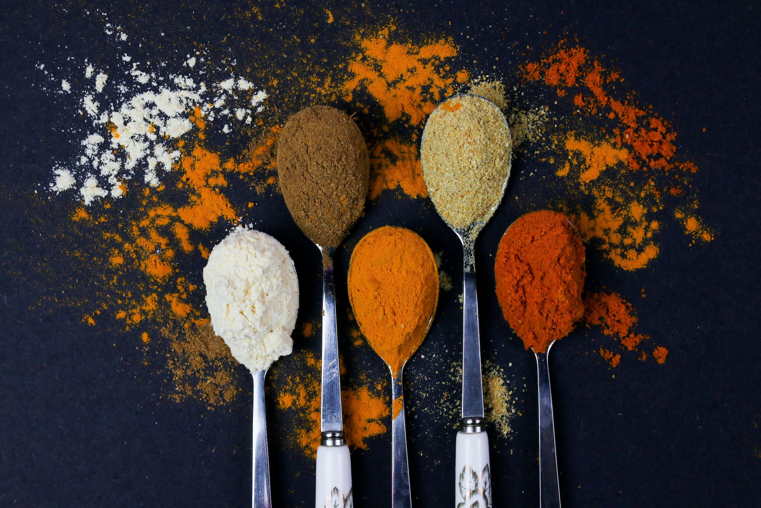
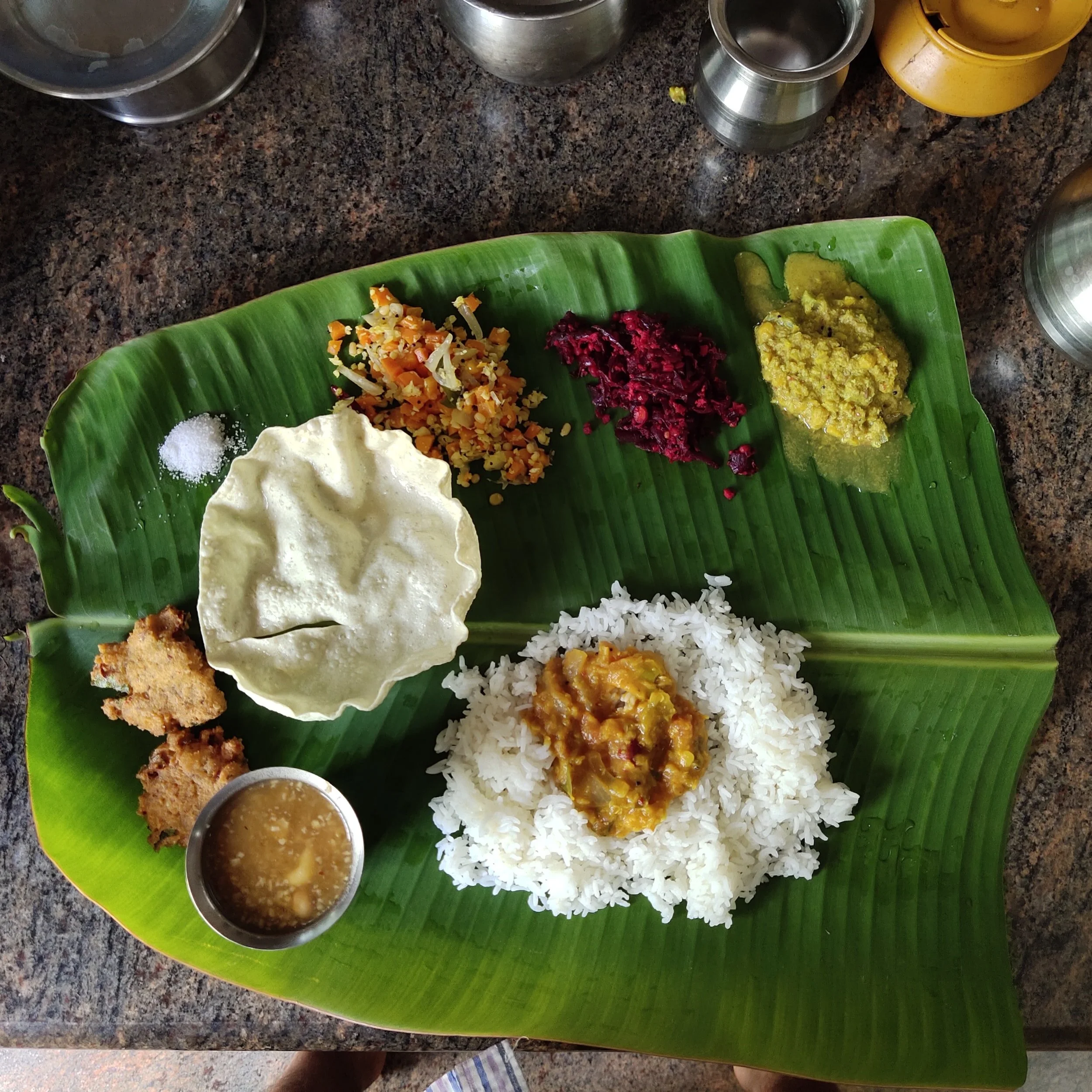
Range Of Choice
A diverse array of cuisines and cooks. From mouthwatering Mediterranean dishes to aromatic Asian delicacies that will help users choose the cuisine they desire and the food-certified home cooks that can cook up the dishes of their childhood or their cravings.
Flexible Scheduling
This empowers users with a myriad of customizable options, enabling them to effortlessly tailor their orders according to preferred date and time, perfectly aligning with their convenience. Moreover, users have the flexibility to choose between hassle-free delivery or self-pickup, putting convenience at the forefront of their culinary experience
Key Learnings
During an intensive 5 month period, I embarked on a holistic design process, surpassing my initial expectations in terms of the acquired knowledge. Embracing design thinking principles enabled me to embark on a profound exploration of problem spaces, employing diverse methodologies to deliver purpose-driven solutions that focused less on aesthetic appeal and more on elevating the experience for the user.
Furthermore, I also learned an important ability to detach from ideas. Through comprehensive user testing, I discovered that while certain designs or concepts may appear advantageous in my perspective, user feedback often illuminated alternative viewpoints, guiding me towards selecting the optimal solution for the users' benefit.
Additionally, another important realization was that every decision demanded sound reasoning and logic, and building within me an internal voice that required a relentless asking of 'why' behind each choice I made. I learnt that UX/UI design was rooted in user empathy and that was only possible when that end user was with you along the entire process for every single decision I made.
Lastly, and most importantly, I came to understand how hard this process is and why it needs to be hard. Designing experiences for people is a challenging task, as we're dealing with complex beings with their own desires and dreams. So the challenge always lies in how to make every single user feel that the product YOU made was specifically made only for THEM! A UX Designer creates meaningful interactions that not only betters the user’s experience but makes it joyous and ecstatic.